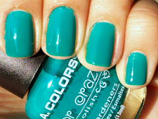
I know the Maybelline Sweet Things collection has gotten a notorious reputation for its bad formula, bad brushes, etc, etc. Their Express polishes have found their way in and out of my collection because I can't make their formula work, but I'm in a blue polish mood right now and I *needed* Pie in the Sky.
After extensively searching all my local CVS, RiteAid, and Walgreens (checked the Duane Reades, too, just in case), I couldn't find any of the polishes from this collection except for the random pinks. BOO! Then I saw the Essie Resort comparisons from All Lacquered Up and happily decided I didn't *need* Pie in the Sky. I was going to get Lapis of Luxury and successfully have my cornflower blue polish. Take that, impossible-to-find drugstore polish!!
Then my husband randomly got sick to his stomach (he's never, ever, ever sick) and I had to rush to Rite Aid for meds. What did I find the same day I had declared to be done with my Pie in the Sky search? Frickin' Pie in the Sky. Last one of its shade on the display. With a coupon!
Now that Pie in the Sky's mine, I have to agree with the blogosphere. What's going on with this brush? Mine had stray hairs that did not want to get clipped in to shape. What's going on with this formula? Runny and chunks?!
After all of that, though, the polish did have some good qualities. It's opaque in two coats. This is probably because the first streaky coat self-leveled itself for me. Really. I think it did. The chunks and bubbles and streaks went on and a minute later it was dry, smoother, and decently shiny. After the second coat, there was still evidence of tiny bubbles or some kind of mess in the polish, but in very trace amounts. Overall, the color and end result made up for this polish's very funky first impression.
I've seen other pictures that show it as a bright sky blue like Zoya Yummy, OPI Just Groovy, or Misa Right Here Now, No More Later. It's not that kind of blue. This is a light cornflower or periwinkle blue shade - meaning light blue with purple undertones. Not even my picture really captures the purple-ness. Even though my index is a little bit out of focus, it's getting closer to being more color-accurate than the other fingers. Imagine a little more purple, a smidge more gray, a little darker, and that's what it looks like!
I thought it was an excellent color to wear right before Easter. I wanted to have a calm color that helped me feel quiet. I was so glad that's exactly what this one did
and in only two coats!


